Thursday, 1 September 2016

Get cardmaking for Christmas...

Yep, tis the time to get busy if you make your own cards - here's a quick CAS card to whet your appetite for my next round of DoCrafts demo-ing!


Come back soon for more pics and details!!!
Happy crafting,
Jak xxx

Saturday, 20 August 2016

Scrapbooking a princess

Good Saturday morning crafty types!
Just a quick post this morning - I've a busy day ahead of me as this is my birthday weekend! Notice it's a weekend of celebrations, not just a day!!! Lucky me!!! So, just quickly, I wanted to share my latest scrapbook page here with you - images are a bit grainy as I swiped it from my an instagram post, sorry! Anyway, this one is all about layers and layers - I wanted a change from the plain backgrounds I've been doing lately and this kind of photo goes well with fussy embellishing and texture. The method I used goes like this -
Stamped a border round the dark pink card stock base,
A layer of distressed patterned paper, inked at the edges and where the paper has been torn - I've backed the torn pieces with patches of contrasting patterned paper.
The photo sits on a lattice die cut panel from my Silhouette Portrait which sits on a patterned paper matted on a contrasting colour of card stock.
There's a pleated paper frame this all sits on.
I've embellished with Hobbycraft paper flowers - gold Xcut die cut doillies, bows, buttons and some pieces from a Docraft Folk Floral Ultimate Paper Pack.

There's all sorts of stuff here from lots of different brands of craft supplies all mixed in together - a bit like dipping in to my box of leftover scraps but not quite so random and quirky...
I hope you like it! 


Layers and layers

Embellishing up close!


Thanks for popping by!
Have a thoroughly inspired crafty weekend everyone,
Love Jak x

Saturday, 6 August 2016

Truffling Around On The Beach...

I keep finding lots of older pics I feel deserve a scrapbook layout! This one is of Sadie when she was 4 years old - we were out beachcombing and I think she tried to bring half of Easthaven beach home with us!
    The main background heart paper is from a paper pack from Tiger which I felt was a lovely contrast to show off the DoCrafts Geometric Neon papers. I love mixing up different styles of patterns. I think you have to make sure you keep an eye on the scales of the design though. This combo works because the main background paper is only two colours and a simple design. The Geometric Neon papers I used have a slightly larger design but the colours are quite muted apart from the flash of neon pink and orange but this compliments the red and pink hearts. If you have lots of older stash, I would recommend trying this out! Sometimes it works and sometimes it just doesn't - it's another creative way to use up your scraps too!


I cut the arrows out on my Silhouette Portrait and backed them with Geometric Neon scraps and embellished the page with alphas from the DoCrafts Geometric Neon Ultimate paper pack. The wooden embellishments were a recent-ish purchase from The Works - I really wish I'd bought more of these at the time as they have come in really handy!!

Thanks for stopping by! Keep crafting,
Jak x

Tuesday, 2 August 2016

Goodies bought in Tiger!!!

Hi folks, just a quickie!
    The Family Strachan were in Glasgow last week and while Leon and The Girls were getting their geek on in various comic/Manga shops I took to trawling the streets for anything crafty that took my fancy. It was kind of slim pickings in the centre of town but the usual suspects were there - Paperchase, Waterstones, Kath Kidston, and Tiger, or Flying Tiger as it seems to be called now. Paperchase was interesting as it had two floors and stocked American Crafts and DoCrafts bits and pieces and there was an area with desks where they must have little crafty sessions but as usual, it was Tiger that got my pennies. Honestly, you just can't beat it for quirky bits and cheap staple supplies like notebooks and canvasses etc, but looook - border punches too. They're a new one on me as the Tiger we have in Dundee doesn't stock them presently. So, they cheekily decided to jump in my basket. At £3 each they weren't exactly going to break the bank now were they. My other purchases were these cute cat "brooch" embellishments - these might end up on cards I think and a roll of sticky "post it" type notepaper - handy for masking off stamps as the whole back of it is sticky.


      Look how cute these kitty deco brooches are. Very kitsch!!!
     
I've tried out the punches and although they only punch one
section of border at a time, they cut really well on all the cardstock and paper I've used so far. Here's a wee sample of one I used for a scrapbook layout...


    Try them out if you find them in a Tiger store near you!!!
    I feel a card or two coming on now I have these deco brooches to experiment with...
Have fun Crafties!!
Jak xxx


Saturday, 30 July 2016

Play Forever scrapbook layout...

Good Saturday morning to you all! After I've done my stint of demoing which consists of mainly card making, I like to return to a bit of scrapbooking. It reminds me of why I got started on this crafting journey and makes me feel less guilty about buying new stash, even if my thing at the moment seems to be using up scraps on my layouts! Anyhoo, this one's called Play Forever and the pic was taken quite a few years ago while we were on a wee holiday in Easthaven. Those are the kind of holidays where the kids just play outside all day on the beach and long into the evening. 
   First of all, I roughed up the kraft 12x12 background with a bit of distressing, stamping and doodling. I selected lots of colourful scraps from my leftovers box with a vague colour scheme that kind of holds them together and makes it work coherently. Then it was a case of embellishing with elements I've not visited in a loooong time. Those turquoise glitter Thickers - can't tell you how old those are. There's also some tiny tags on there that came from the very first K and Company boxed collection I bought off the selly telly back when I had committed myself properly to the hobby/addiction. I think it cost about £36 back in 2007 and I remember feeling sick with guilt that I'd indulged myself and spent that much money on crafting. At the time I thought that it would be the one main expensive thing I'd buy and it would last forever... Hahaha!!! I got the latter part of this right as it's now 9 years on and there's still bits of it kicking around although I have to say the sentiments I thought would come in well handy turned out to be a bit ropey - so they ended up going with a load of unused and unwanted stuff to the local charity shop where for all I know, might have been just what someone else was looking for!
   Enjoy the layout - feel free to let it inspire your imagination and get those scraps out!
Happy crafting all!
Love Jak xxx


Some of those K and Company tags! I don't think I'll ever run out of these!!!


Saturday, 16 July 2016

Demo part 2

Ok, so as promised, here are a few more of those demo cards, starting off with embossing folders. I love a bit of embossing and I've recently started experimenting with embossing patterned papers etc with results I really, really like. Here's what I mean...


If you look closely, you'll see I've run the triangles background paper through a honeycomb embossing folder which just gives a bit of added interest and dimension to the card. But, if this is too much for you, just stick with plain cardstock.


This time I ran plain white cardstock through the DoCrafts Dogstooth embossing folder and then sponged gold acrylic paint lightly over the embossing which gives the cardstock real depth. You could easily do this with an inkpad if preferred, but I like to get mine into the sunk back bits too.

I soon got on a roll with this and began inking the embossing folders before I put the card inside so it presses the ink into the cardstock as it's embossing. I even tried inking and debossing too!

ink embossed paper

ink debossed cardstock


As you can see, the results are quite different with the debossed one being a lot bolder.
Next, I tried embossing a background I'd stamped with some colourful pigment inks. I loved this and although the Moroccan Flowers embossing folder is quite different in design style from the Folk Floral stamps, they really do work together. I think the key thing here is to make sure you experiment and mix things up. Sometimes things that shouldn't work together actually really do, so, be brave!

stamped then embossed


The embossing shows up clearly from this angle!
Then I got really carried away and did this acetate tag. I rubbed a bit of gold acrylic Ariste paint on the back of the tag, just to give a bit more definition to the embossing...


It's quite subtle and a bit quirky - I love it!

I hope you have enjoyed some of these samples and hopefully I've inspired you to give these techniques a try or revisit if maybe you've got a bit bored with them.
Have fun,
Love, Jak
xxx

Thursday, 14 July 2016

Another demo done!

Hi everyone, hope you are all feeling crafty today! I'm still buzzing from my latest demo for DoCrafts! This time we had a different kind of demo and instead of introducing crafters to our latest products we actually focused more on techniques - these being of a distressing and inky, painty nature. It was such good fun to go back and rediscover these techniques using the DoCrafts inks and paints, my only handicap being that there was no facility/power for speeding up drying times with my heat gun but my ladies were very patient and loved having a go at getting their crafty hands dirty too.


Lots of goodies to play with!

These paints are great quality with lots of pigment
So lets start with some marbling....


Once I'd nailed the natural looking black and white stuff I drifted towards a more colourful approach...heehee! This is such an easy technique to do and if you don't like the way things are going you can lightly brush out or dab over with a bit more paint! I took a piece of the natural black and white version and incorporated it into a card featuring one of the DoCrafts Gorjuss stamps and some debossed vellum.

She's such a cutie
Here's that piece of marbling in the background. The card has also been embellished with the X- cut Woodland Flourishes die set which I've found to be pretty versatile as it seems to go well with lots of different styles of cards. 

Next up was a bit of crackle painting...
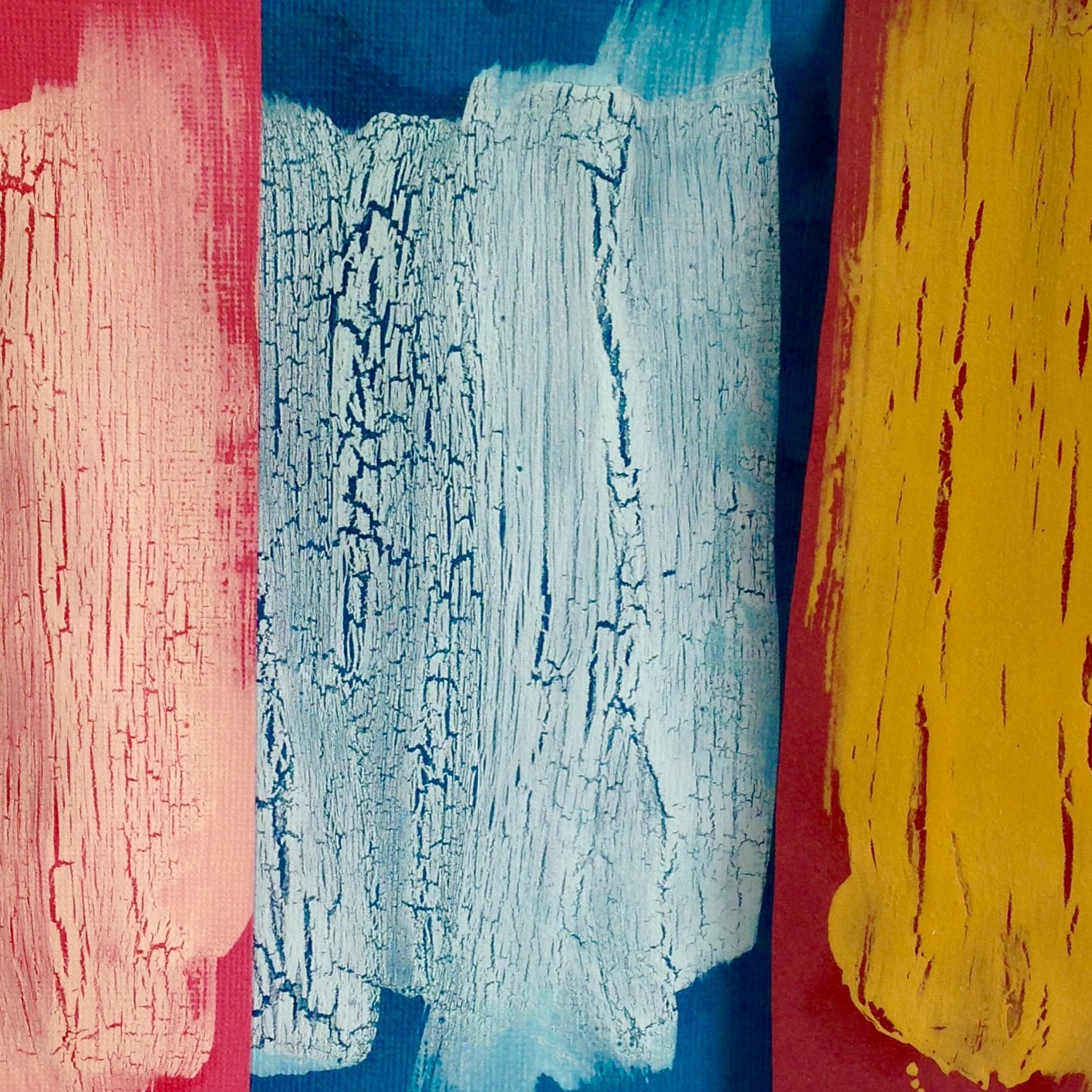
You will need: Coloured cardstock, loads of PVAglue - the cheaper, the better, and acrylic paint - any colour - just make sure it contrasts with the colour of the background cardstock you are using.

It crackles as if by magic!
Now, I don't mind admitting that this took me quite a few goes before it worked but that was to do with me being an idiot rather than how difficult it was to do. I would say, the main thing to remember here is to work quickly, be messy with the bog standard pva glue and don't be tempted do go back and overwork your paint. One sweep of paint on top of the glue is all you need. I sort of imagine it as just sitting on top of the glue. Now, in an ideal world a quick zap of the heat gun doesn't go amiss at this stage but it really isn't essential as science/physics or some kind of sorcery takes effect and the paint starts to pull away from the slower drying pva underneath. Once dried this makes an interesting background for a card too! 

Gorjuss again!
Doesn't that crackle work well with a bit of Gorjuss? I love that this card worked well combining the crackle, distressy feel with the dark and mysterious Gorjuss girl! I used an inky technique for the stamped picture frame that contains Gorjuss, which leads us nicely on to the next technique which is:- ink spritzing and distressing.

Springtime colours
Now this is one style that's usually more associated with Tim Holtz distressing inks but I wanted to try giving it a go with the DoCrafts Artiste ink pads as these are water based inks too so work in exactly the same way. Start with your lightest colour ink first, pat down on a craft sheet or glass cutting mat - even a sheet of acetate would work here, spritz with a bit of water and start dabbing the card around in the ink. I guess you could add as many layers of colour here as you like but I would stop at three. Why? I don't know - other than the main principle of colour mixing which says mixing three secondary colours together makes brown ( I know yellow is a primary. I'm just trying to illustrate a point here...)  This is one of those rare times where less is more and if you want to stamp an image over the colours you've mixed then you don't want to make them too dark or muddy! Here's a close up of all that beautiful inky spritzing!

Inky spritzing overstamped with a brown pigment ink
Of course, the real beauty here is that no two cards will ever be the same! Fabsy!!!
Ok, so there are quite a few cards I have to let you see but I'm going to wind this post up for today as duty calls (pesky kids eh!)!!!
Thanks for coming  by for a look - I'll get those other cards up here ASAP!
Jak xxxx